An Interview with Alison Beattie, Director of User Experience – Target
The past few months have been insanely busy. We finalized our product, shipped Keen pre-orders and had a baby!
We’ve been moving fast but this milestone also lends itself to pause and reflect not only on how we got here, but also honor those who helped us! (P.S. have you seen what Prevention Magazine said about Keen?)
To start, we chatted with Alison Beattie, my friend & UX/graphic designer, on the origin of the HabitAware logo!
Alison & I met while working on a massive branding & website launch at Fallon, one of the top ad agencies in Minneapolis. I asked for Alison’s help because I didn’t feel I had the design chops – or the confidence, but that’s a story for another day – to create the HabitAware logo:
![]()
Why does the HabitAware logo look the way it does? The answer has to do with core logo design principles, and, of course, our own “Why?”
The Design Process
Aneela: Firstly, Alison, thank you for joining us on this journey and being so supportive through it all. I really appreciate you sitting down to take our readers through some of your design choices  Can you start by tell us a little about the design process?
Alison: Thank you, Aneela! Sure, the first thing I do when working on a logo is try to understand what the company is about and what they are trying to accomplish. A good logo should communicate this easily, while also creating a bit of an “ah-ha!” moment. I also want to make sure I design something that my clients will like! I always start with a moodboard of sample designs, fonts, markings and colors to gauge client design preferences. From this brainstorming session I take time to sketch by hand before translating my ideas into a vector graphic logo.
HabitAware’s Shapes and Colors
Aneela: Can you tell our readers why you choose the colors of green and yellow?
“HabitAware is all about strengthening the mental health of their customers.”
Alison: Color is an important aspect to design. Color evokes emotion. I chose colors that were pastel and almost transparent to give the logo a calming effect. Green and yellow are “nature colors” that represent health and growth. I chose them because HabitAware is all about strengthening the mental health of their customers.
Aneela: What about the circles? Why this shape? Why not squares?
Alison: If you look closely, the circles of the HabitAware logo overlap slightly, achieving the effect of a spotlight coming into focus. Since HabitAware’s goal is to help people build their awareness, I thought this to be an appropriate metaphor. I stayed away from sharp edges and angles so that the logo would provide an inviting warmth.
Ladders or Letters?
Aneela: Lastly, the center mark is my favorite. I love the meaning behind it…can you share a bit about it?
“It’s all about rising up, climbing to a new level, becoming a better you!”
Alison: The mark in the center are an H & an A, for HabitAware. I fused them together in a way, to give the visual effect of looking like a ladder.
Aneela: Yes! I love that visual play with the letters & the ladder symbol…Because it’s all about rising up, climbing to a new level, becoming a better you!
****
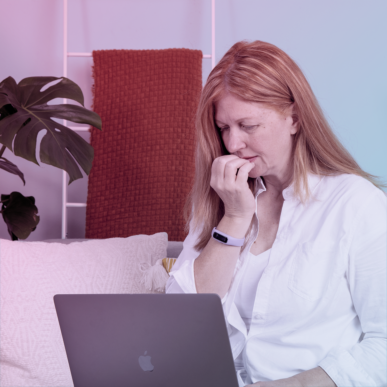
When people ask me why I gave up the career in advertising that I loved to pursue HabitAware, they chime in with the overused saying “hardware is hard” and similarly dejecting lines about entrepreneurship and customers and lack of sleep, etc. etc. But my answer to their why is always the same: Our why is in our logo. We want to help people like me struggling with body focused repetitive behaviors (bfrbs) like hair pulling (trichotillomania), nail biting (onychophagia), skin picking (dermatillomania) to build their awareness, find their own calm and rise up to a better self.
About Alison Beattie:
Alison Beattie is a creative thinker and tinkerer. She’s and experience design maker, honing her skills at various ad agencies (including Colle McVoy and & Fallon), and now runs Digital User Experience at Target. Alison founded Minneapolis MadWomen, an organization hell bent on ensuring career equality for women in creative fields. In her spare time she dabbles in writing and podcasting, oh and she’s also mom to a feisty four year old! In short, Alison is all the things!
#origin #design #branding